Krispy Kreme Store
Interior Design
Krispy Kreme constitutes one of the most revered brands of America, particularly in the South. It boasts a heritage of evoking warm, delicious memories since 1937. Of course, its signature is the immortal Original Glazed doughnut, but KKD has sought to expand it’s footprint, seeking ground in other “day parts,” or meal time associations.
Brand Strategy | Retail Environment Architecture & Design

The Design Office Of John Murph was invited to re-imagine the store interior environment in such a way as to allow the introduction of new offerings and categories without disrupting the consumer’s connection with the main event - doughnuts, and lots of them. In this case, the new offering was a soft serve ice cream to be named “Kool Kreme.”
The Design Office’s solution included the creation of zones within the retail environment, compartmentalizing Krispy Kreme’s menu in an easily codifiable way. This leveraged a new modularized, multi-faceted counter configuration, a reconceptualized soffit structure and menu board design, and a new color and texture differentiation between zones.

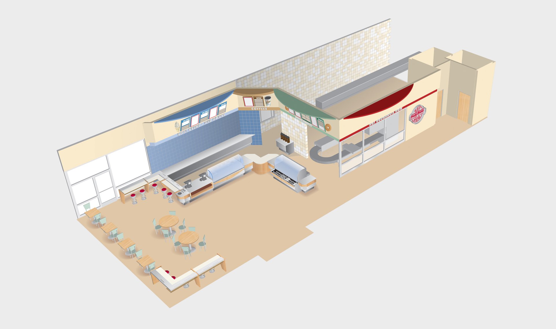
The result was a store design that was bright and engaging, providing clarity and education to the consumer. The new zone differentiation was clearly visible, allowing visitors to easily understand the new product variety.


